If you live in a wealthy, liberal town like Boulder, CO, you’ve likely seen your fair share of Toyota Prii (this is supposedly the plural of Prius). Heck, you might even own one. I decided to collect a little data. I used my iPhone stopwatch to record wait times between seeing Prii. I walked at a near-constant speed, along a more or less linear transect along 13th Street, from Arapahoe to Spruce. I recorded for 10 minutes, hitting the “lap” button each time I saw a Prius (any year, parked or driving). There is some risk of counting one vehicle multiple times, but because I walked in one direction and only recorded for 10 minutes, I assume the risk is relatively low (unless Prius owners love driving so much, they just go out and do laps around city blocks – quite possible).
Below is some code I’ve thrown together to analyze the data I collected. The objective here is to predict the expected wait times between Prius sightings, and to quantify uncertainty in this expectation. Along the way, we’ll check out the max time you should expect to wait, and test a few assumptions of the model.
Load the relevant libraries:
suppressMessages(library(magrittr))
suppressMessages(library(tidyverse))
suppressMessages(library(lubridate))
suppressMessages(library(rstan))
rstan_options(auto_write = TRUE)
options(mc.cores = parallel::detectCores())
Load the data (lubridate package to convert weird minute-seconds to numeric integers).
wt_times <- c("00:11", "01:08", "00:06", "02:06", "00:06", "00:16",
              "00:00", "00:06", "01:43", "00:13", "00:05", "00:13",
              "01:59", "00:45", "00:27", "00:51", "00:02") %>%
  ms %>%
  as.numeric  %>%
  data_frame %>%
  set_colnames("wait")

n_obs <- length(wt_times$wait)
First observation: I saw 17 Prii in 10 minutes – that strikes me as a lot! I make no attempt to calculate the total number of Prii in Boulder from these observations, but that seems like a possible feat with some effort.
Let’s take a look at the distribution (it took some time, but I’m pretty solidly parked in ggplot2 train these days).
wt_times %>% ggplot(aes(x = wait)) +
stat_bin(binwidth = 12, alpha = 0.5,
fill = "green", colour = "black") +
xlab("Seconds between Prius sightings (Boulder, CO)") +
theme_minimal() +
theme(text = element_text(size=20))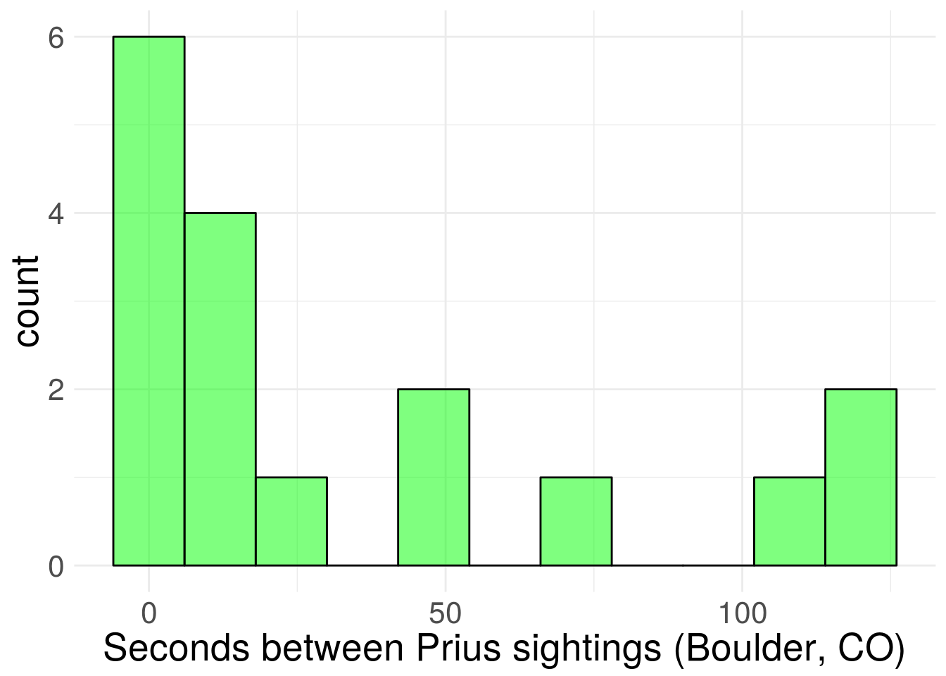 Figure 1. Sampled distribution of wait times.
Based on the graph and similarity to other problems, it seems reasonable to assume wait times are exponentially distributed. I’ll also assume that the observations are dictated by a single rate parameter (easy to imagine density of Prii vary across neighborhoods, which would violate this assumption).
To be totally overkill, I’m going to fit the model using Stan, to numerically approximate the posterior distribution of the exponential rate parameter. I’m pretty sure there’s an analytic solution for the posterior in this case (gamma distributed conjugacy?), but I’m just gonna do the Stan thing, since it generalizes well to more complex problems, and because I’m still pretty bad at real math.
Usually I’d write the Stan code in a separate file because it makes life easier, but I’ll write it directly into this post as a string to keep the post self-contained. I’m using a gamma prior for the exponential rate parameter, and I’m putting the shape and scale parameters as input to the Stan model to make assessment of prior sensitivity easier.
stan_string <- "

  data{
    int<lower = 0> N;
    real<lower = 0> y[N];
    real<lower = 0> pr_shape;
    real<lower = 0> pr_scale;
  }

  parameters{
    real<lower = 0> beta;
  }

  model{
    beta ~ gamma(pr_shape, pr_scale);
    target += exponential_lpdf(y | beta);
  }
"
stan_exp <- stan_model(model_code=stan_string)Stan parameterizes the exponential distribution using the rate, so a prior distribution that is concentrated near zero informs the model that wait times are long. This post was motivated by a belief that wait time between Prius spottings is short, so I’ll use a scale parameter that communicates this. Let’s keep things pushed toward zero (decay shape) with shape equal to one, and a large scale parameter to make for a long tail. I’m spit-balling here, but it seems like seeing a Prius every minute would be reasonable, so we’ll make both shape and scale equal to one. Choices about the prior should be made before looking at the data, but we can see how sensitive our inferences are to changing the prior (I don’t report the results in the blog, but the model doesn’t seem very sensitive to the prior, even with only 17 observations).
Here’s what this prior looks like.
xseq <- seq(0, 5, length.out = 100)
plot(xseq, dgamma(xseq, shape = 1, scale = 1), type = "l", lwd = 2,
xlab = "Rate parameter",
ylab = "Density",
cex.axis = 1.25, cex.lab = 1.25)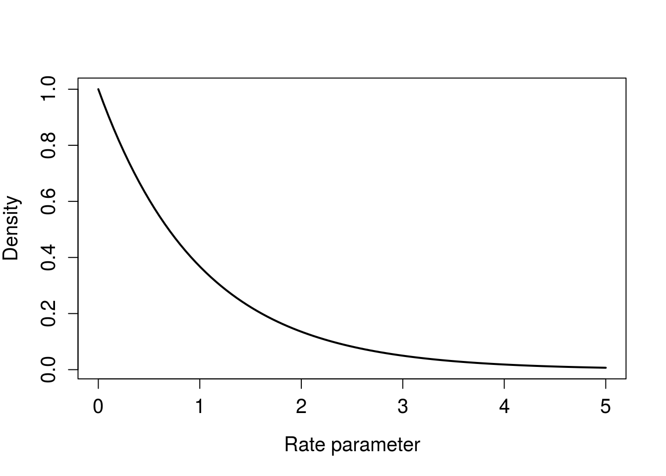 Figure 2. Gamma prior for exponential rate parameter.
Bundle the data and run Stan.
stan_in <- list(
  y = wt_times$wait,
  N = n_obs,
  pr_shape = 1,
  pr_scale = 1
  )


stan_fit <- sampling(
  object = stan_exp,
  data = stan_in #,
  #iter = 1000,
  #thin = 100
  )

print(stan_fit)
## Inference for Stan model: 45ee75e197adc87a0c44d348f2d7068b.
## 4 chains, each with iter=2000; warmup=1000; thin=1;
## post-warmup draws per chain=1000, total post-warmup draws=4000.
##
## mean se_mean sd 2.5% 25% 50% 75% 97.5% n_eff Rhat
## beta 0.03 0.00 0.01 0.02 0.02 0.03 0.03 0.04 1501 1
## lp__ -82.15 0.02 0.72 -84.13 -82.31 -81.87 -81.70 -81.65 1687 1
##
## Samples were drawn using NUTS(diag_e) at Thu Jun 14 11:49:01 2018.
## For each parameter, n_eff is a crude measure of effective sample size,
## and Rhat is the potential scale reduction factor on split chains (at
## convergence, Rhat=1).traceplot(stan_fit)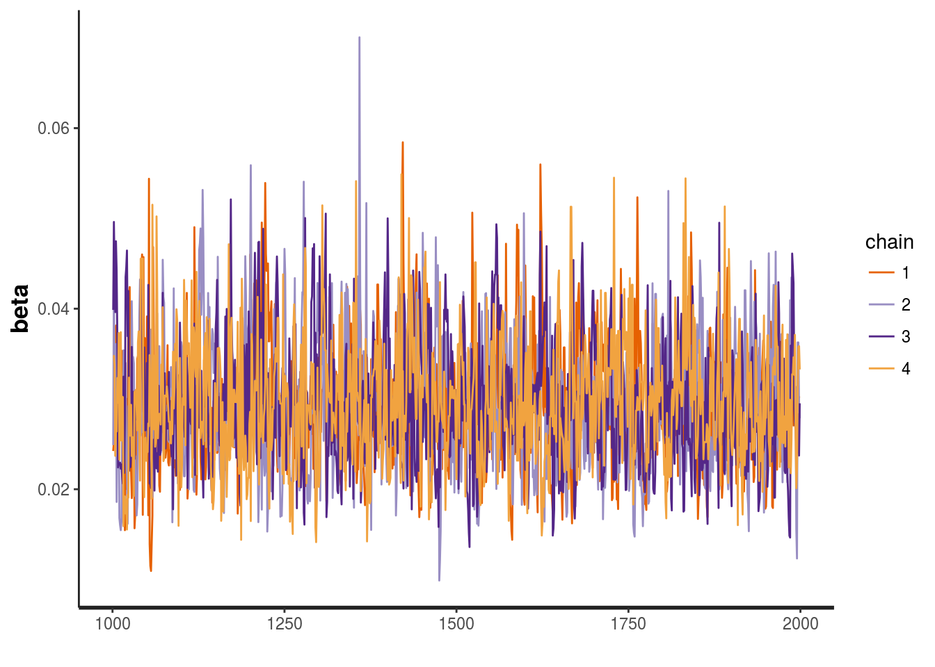 Figure 3. Traceplot looks nice and grassy.
This is a tiny model that runs quite quickly. The default of 4000 iterations and 50% warm up is probably more than necessary, but the number of effective samples is good, as are the rhat values being 1. The traceplot looks nice and grassy, without any indications the chains are getting stuck on parameter values. The model returns a few warnings about boundaries, but this is not a concern (as the message itself says).
Next we can use the posterior draws to make inferences about the data.
#extract posterior draws from model
exp_post <- extract(stan_fit)
#visualize posterior, but 1/rate, to see expected wait time scale
exp_post %>% data.frame() %>%
ggplot(aes(x = 1/beta))+
geom_density(fill = "green", alpha = 0.5) +
theme_minimal() +
xlab("Expected wait time") +
theme(text = element_text(size=20))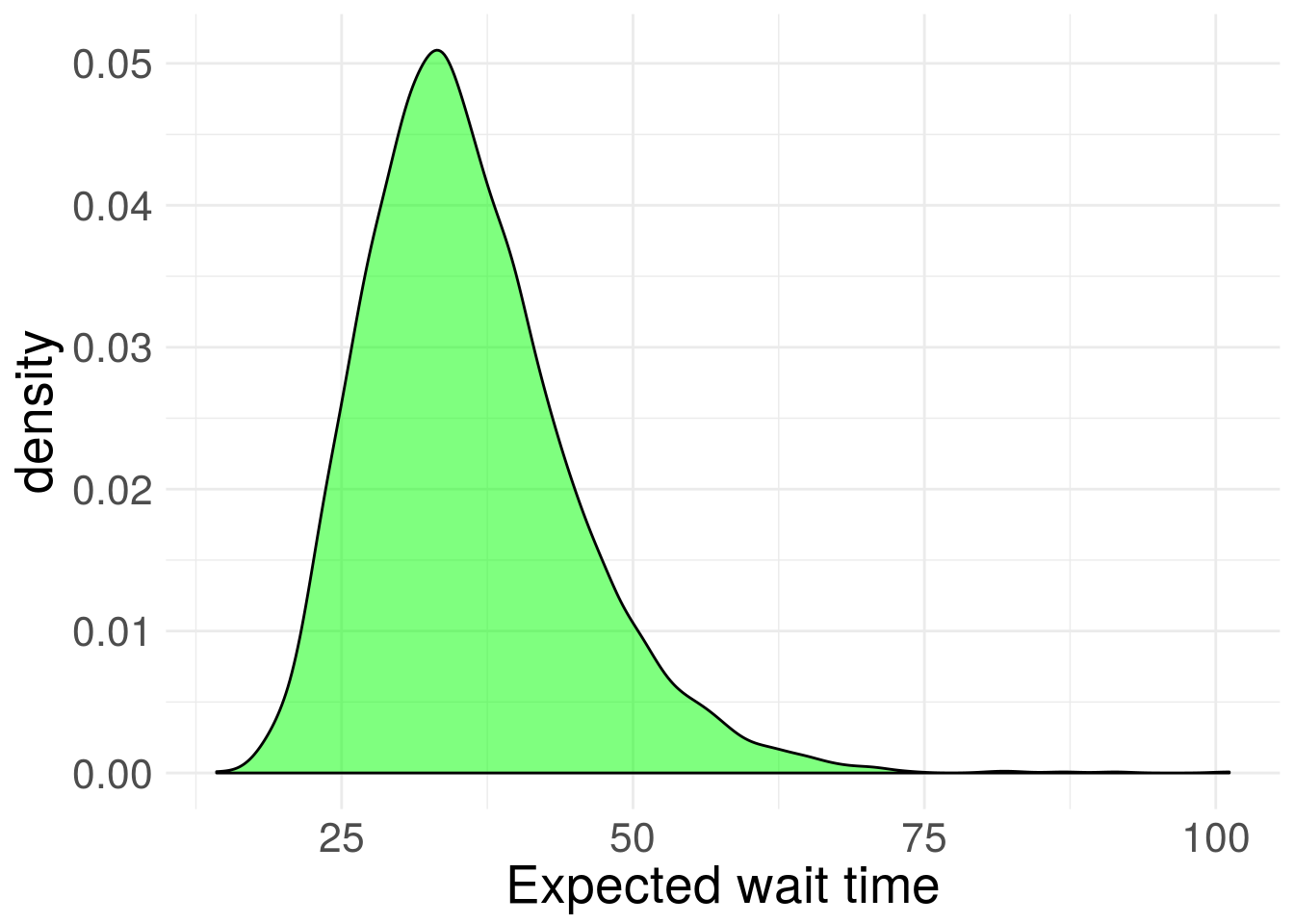 Figure 4. Inferred posterior distribution for exponential rate parameter.
Compute credible interval of expected wait time
cred1 <- quantile(1/exp_post$beta, c(0.025, 0.975))
cred1
## 2.5% 97.5%
## 22.44922 56.47759So there’s a 95% chance the expected wait time between Prius spottings is between 22 and 56 seconds.
We can also easily see the probability that the expected wait time is less than, say, one minute.
mean(1/exp_post$beta < 60)## [1] 0.986Also valuable in a Bayesian framework is the ability to conduct posterior predictive checks. We can use posterior draws of the rate parameter, and generate simulated data from this exponential distribution. Perhaps the wait times have more variation than the exponential distribution allows for. We simply need to compare the observed variation to that of the simulated data sets:
post_pred <- exp_post$beta %>% map(~rexp(n_obs, rate = .x))
pred_var <- post_pred %>% map_dbl(~var(.x))
hist(pred_var,main = "",
     xlab = "Posterior predictive variance",
     cex.axis = 1.25, cex.lab = 1.25)
abline(v = var(wt_times$wait), lwd = 2, col = "green")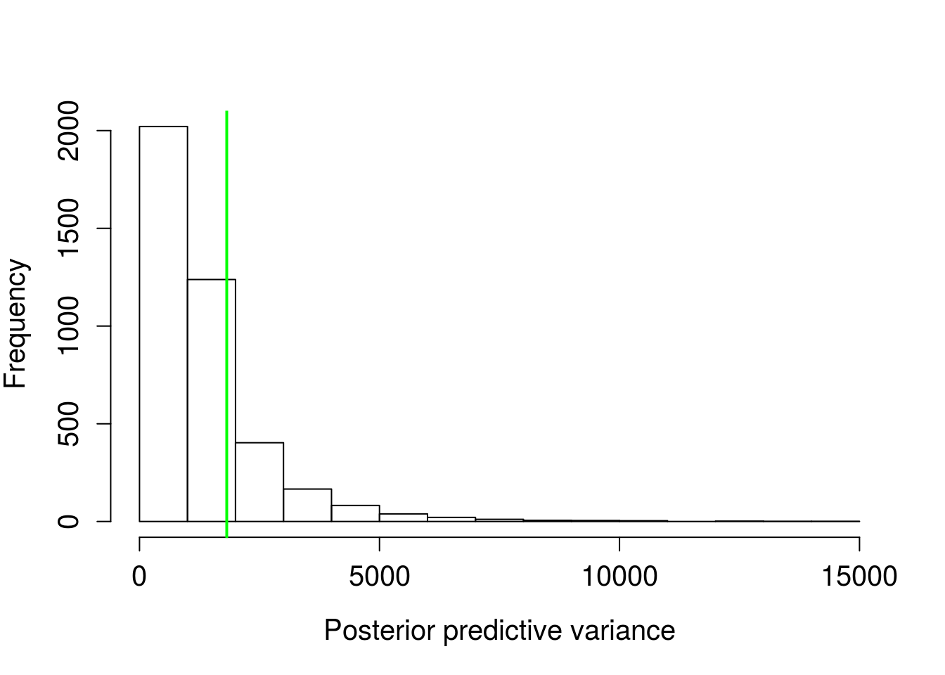
mean(pred_var > var(wt_times$wait))## [1] 0.21725Figure 5. Distribution of variances from posterior predictive distributions, green line is the sample variance.
There’s a ~22% probability of simulated data having variation greater than the observed. This isn’t too far off. The nearer to 50%, the more consistent the simulated data and observed. The exponential distribution model as-is seems fairly adequate.
We can also get some idea of the max wait time conditional of the data.
pred_max <- post_pred %>% map_dbl(~max(.x))
hist(pred_max,
     main = "",
     xlab = "Posterior predictive maximum waits",
     cex.axis = 1.25, cex.lab = 1.25)
abline(v = max(wt_times$wait), lwd = 2, col = "green")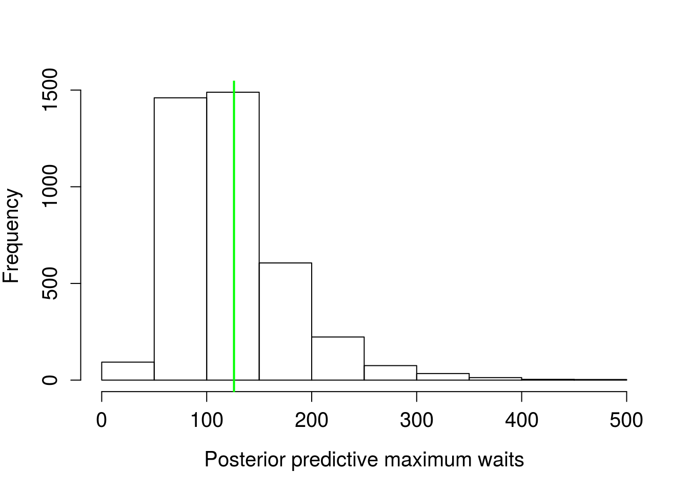
quantile(pred_max/60, c(0.025, 0.975))## 2.5% 97.5%
## 0.8401799 4.4382242Figure 6. Distribution of maximum wait times from posterior predictive distributions, green line is the sample maximum wait time.
Wow, the model predicts wait times should pretty much always be less than five minutes. That’s a lot of Prii flashing past your face!
We can also visually assess the simulated and observed distribution shapes by constructing quantile-quantile plots. I find it a bit easier to see departures by looking at the observed quantiles versus the difference in observed and simulated quantiles:
prbs <- seq(0,1, length.out = n_obs)
obs_quants <- quantile(wt_times$wait, prbs)
lev <- 0.95
up <- 1 - (1 - lev)/2
lo <- (1 - lev)/2
pred_quants <- post_pred %>% map(~{quantile(.x, prbs) }) %>%
do.call(cbind, .) %>%
data.frame() %>%
gather(key = "draw", "quants") %>%
group_by(draw) %>%
mutate(obs_quants = obs_quants) %>%
ungroup() %>%
group_by(obs_quants) %>%
summarise(upper = quantile(quants, up),
lower = quantile(quants, lo)
)
#gross, but not sure how else to compile this for polygon
pred_poly <- data.frame(
obs_quants = c(pred_quants$obs_quants,
rev(pred_quants$obs_quants)),
pred_quants = c(pred_quants$upper - pred_quants$obs_quants,
rev(pred_quants$lower-pred_quants$obs_quants))
)
pred_poly %>% ggplot(aes(x = obs_quants, y = pred_quants)) +
geom_polygon(alpha = 0.5, fill = "green") +
geom_hline(yintercept = 0, lty = 2) +
theme_minimal() +
ylab("Simulated - observed quantiles") +
xlab("Observed quantiles") +
theme(text = element_text(size=20))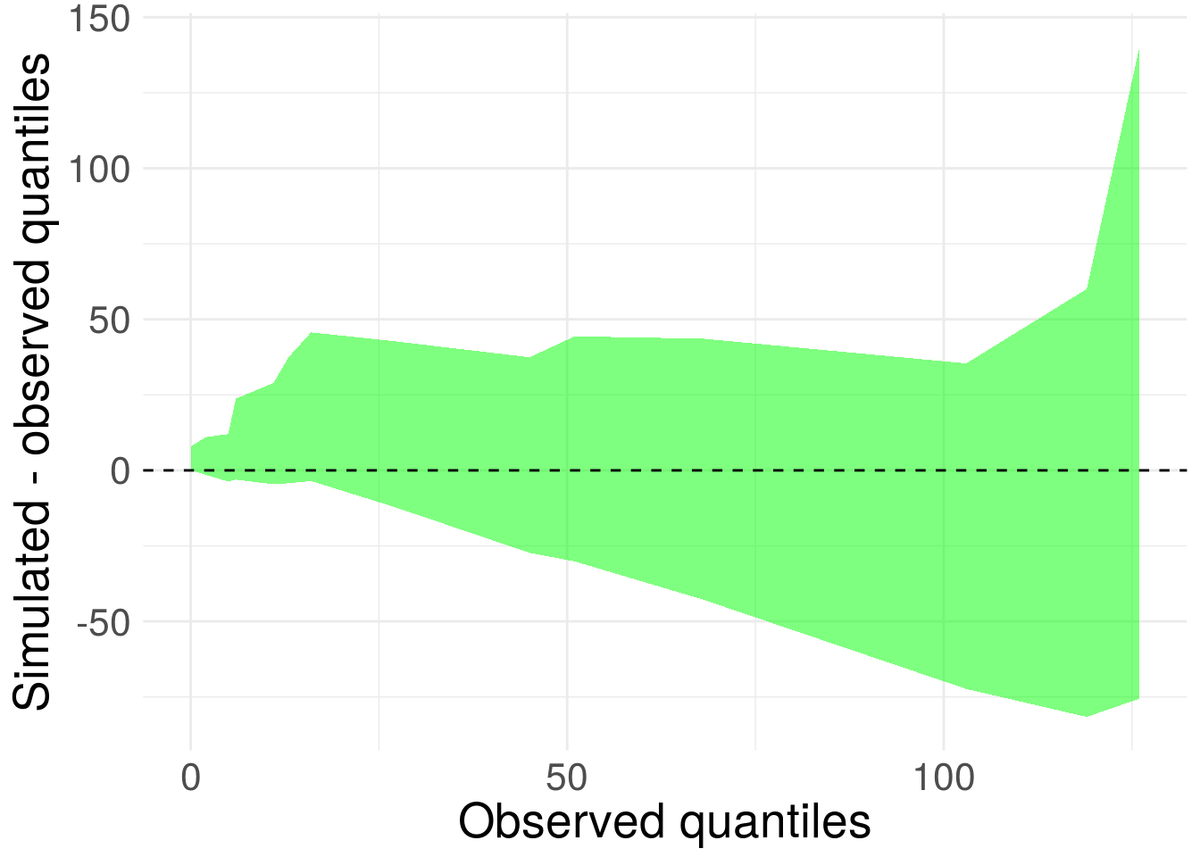 Figure 7. 95% credible interval for difference between posterior predictive quantiles and sample quantiles for Prius sighting wait times.
Ideally, the shape should be relatively flat (exponential mean scales with variance, so heteroskedasticity is fine) and centered on zero. Overall this looks pretty good. The replicated draws to encapsulate zero. We confirm the exponential model isn’t too bad.
Another approach would have been to bootstrap the observations. tidverse makes this extra easy. Let’s see how the approximate confidence interval for the expected wait time from the bootstrap compares to the credible interval.
#10,000 bs reps
boots <- 1:1e4 %>%
map_dbl(~{wt_times$wait %>%
sample(replace = T) %>%
mean})
hist(boots)
abline(v = mean(wt_times$wait), lwd = 2, col = "green")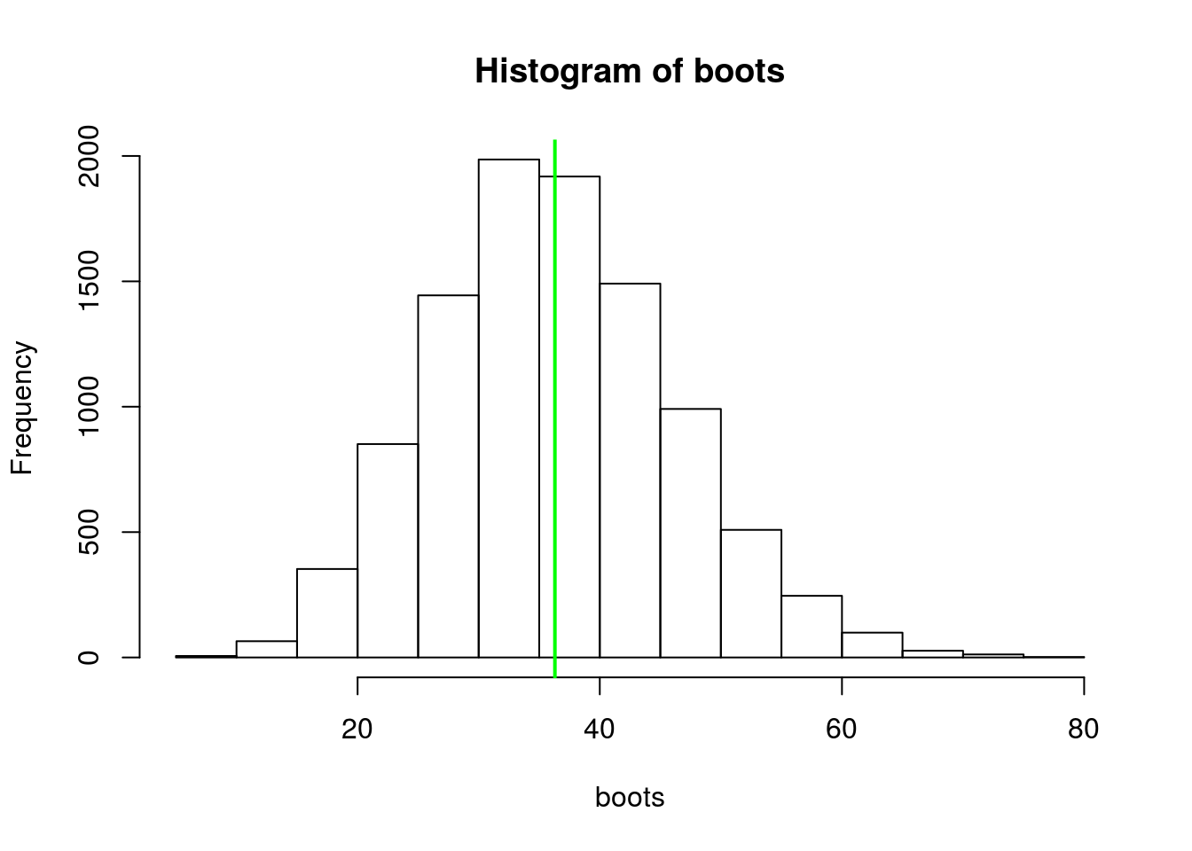 Figure 8. Distribution of bootstrap replicates for mean exponential wait times. Green line is sample mean (what’s up with me and green today?).
qnts <- seq(0,1, length.out = 100)
quantile(boots, c(0.025, 0.975))
## 2.5% 97.5%
## 18.05882 57.35294qqplot(boots, 1/exp_post$beta,
xlab = "Bootstrap quantiles",
ylab = "Bayesian quantiles",
cex.axis = 1.25, cex.lab = 1.25)
abline(0,1, col = "green", lwd = 2 )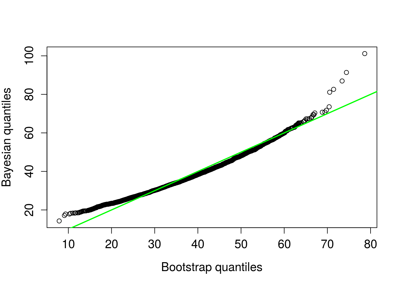
Figure 9. Bootstrap quantiles compared to posterior predictive quantiles. 1 to 1 line in green.
The intervals and qqplot both indicate similar predictions, the credible interval reported above is slightly narrower.
If the exponential distribution is a bad model to explain the wait times, it’s difficult to tell with so few observations. Conditional on the data at hand, the exponential seems to be a good assumption. Another worthwhile predictive check would be to assess if the observations are independent of each other and consistent over time/space. Ideally, the behavior of the sampling in the data would be consistent with what an exponential distribution would produce (exchangeable observations). I believe this would require some sort of quantification of auto-correlation. I will hold off on doing any of that.
Probably could have stopped at the summary statistics, but either way the takehome is clear: you don’t have to wait around long before seeing a Prius in Boulder.
Would love to hear your thoughts on the post, any and all comments and critiques are welcome.